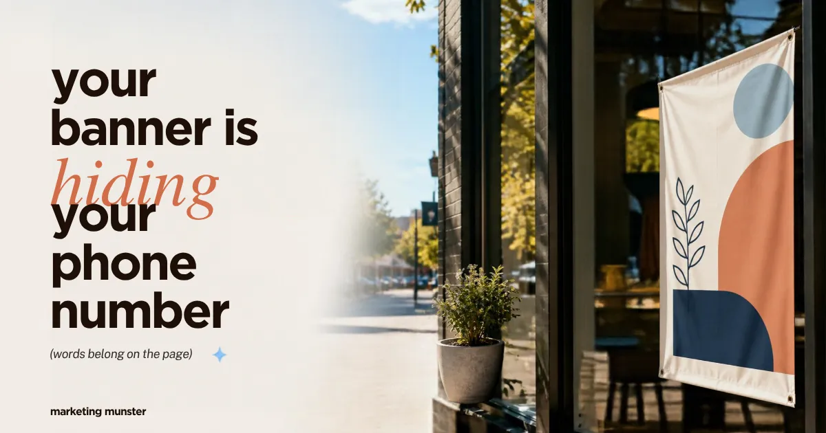
Your Banner Is Doing Two Jobs: Why the Words Belong on the Page, Not in the Picture
The banner on the phone
Illustrative scenario, not a client story; results vary.
Picture a tailor and alterations shop whose homepage is one wide banner: a navy jacket pinned to a dress form, soft window light, chalk marks on the lapel. Set across it in script: "Rush hems in 48 hours · Open Tue to Sat, 10 to 6 · Call 555-0142." A designer made it, the owner loved it, and it went into the homepage as a single image.
Now open it on a phone, the way a customer might, holding trousers that need taking up before Saturday. The script shrinks with the screen. They pinch to zoom, then try to tap the number. Nothing happens, because there's no phone number there, only a picture of one. They can't copy it either. A screen-reader user hears whatever description the image was given: a file name, "banner," or nothing.
Every word is visible. None of it is usable.
That's the belief this post takes apart: "It's on the website, so people and Google can see it." The number is the last step of the path in Your Contact Page Isn't Capturing Leads: Form, Confirmation, Handoff, and when that step is a picture, the path can end one tap early.
A banner is doing two jobs
The idea this post builds on: a designed banner is doing two jobs, and only one of them belongs inside the image.
The picture job is mood and craft: the jacket on the dress form says this shop is careful. Only an image can do that.
The words job is the offer, the hours and the number: facts a customer acts on. They want to tap them, copy them, enlarge them and hear them read aloud. Page text does all of that. A picture of text doesn't.
A design app flattens both jobs into one file, gluing the words onto the photo as pixels. Fine on a printed flyer. On a web page, it quietly takes away everything the words were there to do.
Once you see the banner as "picture plus words, glued together," the fix isn't a redesign. You unglue them. The photo stays; the offer, hours and phone number go onto the page as real text beside or below it, styled to match. Design still carries the look. It just shouldn't carry the only copy of the message.
The point: only the picture job belongs inside the image.
What W3C means by "images of text"
The W3C, which publishes the Web Content Accessibility Guidelines (WCAG), calls words glued into a picture images of text. WCAG is a widely used guideline, not a law, and Wix's own help cites it. Read it as practical advice about what works for people.
W3C's explainer opens with two lines: "Use text instead of pictures of text." and "People cannot alter how text looks in images." (W3C, Understanding SC 1.4.5: Images of Text)
The guideline itself reads: "If the technologies being used can achieve the visual presentation, text is used to convey information rather than images of text except for the following:" The two exceptions, in plain words: customizable (the visitor can adjust the image of text to their needs) and essential (that exact presentation is the information). Logos are the classic essential case: "Logotypes (text that is part of a logo or brand name) are considered essential." Nobody is asking you to retype your logo.
Two lines keep it from being stricter than it is. "Where images of text are used in addition to text to convey the same information, and where both are presented to the user, this success criterion is met." A banner can keep its words if they're on the page too. And from the definition: "This does not include text that is part of a picture that contains significant other visual content."
The point: the guideline's default is real text whenever you can get the same look. For "Rush hems in 48 hours" over a photo, you can.
What Wix's own help says
If your site is on Wix, you don't need a standards body's word for it. Wix's accessibility article on images says: "This article is based on the following success criteria:" and lists Non-text Content (1.1.1) and Images of Text (1.4.5). (Wix Help, Accessibility: Preparing Your Images and Galleries)
On images that are only words, Wix writes: "As they are not "real" text elements, images of text cannot be read by search engines or screenreaders. We recommend avoiding them where possible, and replacing them with real text elements to improve SEO and accessibility on your site."
That's Wix's wording. Google's belongs right next to it: "Google uses alt text along with computer vision algorithms and the contents of the page to understand the subject matter of the image." So Google does look at pictures. The real question is which signals you hand it, and page text and alt text are the ones you control.
For a photo that has some words on it, Wix's advice is to put words that matter in the image description, and it gives the other half too: "If the text does not have context or doesn't contribute to the content of the site, you do not need to add it to the image description."
The point: the platform you build on says what the guideline says.
What Google says alt text is for
Alt text is the short description attached to an image in the page's code. Screen readers read it aloud, and Google uses it with the image and the page.
Google's image guide says how to write it: "When writing alt text, focus on creating useful, information-rich content that uses keywords appropriately and is in context of the content of the page." (Google Search Central, Google image SEO best practices) And it draws a line on an old habit: "Avoid filling alt attributes with keywords (also known as keyword stuffing) as it results in a negative user experience and may cause your site to be seen as spam."
Compare two alt texts for the tailor's photo: "tailor alterations hems best tailor near me" versus "Navy jacket pinned to a dress form, with chalk marks on the lapel." The first is a keyword slot. The second tells a screen-reader user what everyone else sees.
Google's page doesn't promise that alt text moves a site up in results, and neither do we.
The point: alt text is information, not a keyword slot. Write it for the person using a screen reader.
The alt-text decision walk
W3C's "An alt Decision Tree" turns alt text from a chore into a few questions, and admits its limits: "This decision tree does not cover all cases." (W3C WAI, An alt Decision Tree)
Illustrative scenarios, not client stories; results vary.
The tailor, after ungluing. The three lines now sit under the photo as live text with a tappable number. If the old banner stays with its words baked in, the branch reads: "… and the text is also present as real text nearby. Use an empty alt attribute." If the shop swaps in a text-free photo, it's just a photo: describe it if it adds meaning, or mark it decorative if it doesn't.
The car detailer's fall flyer. The promo page is one print-shop flyer: a gleaming hood, a seasonal package, what's included, the dates and "Call 555-0167." Nothing else is on the page. The branch: "… and the text in the image is not present otherwise. Use the alt attribute to include the text of the image." Better still, put its words on the page too. If the flyer is also a booking button: "Use the alt attribute to communicate the destination of the link or action taken." The honest choice is words on the page or words in the alt text. Never neither.
The sign shop's logo and gallery. The logo is all lettering, and the owner worries they have to "turn the logo into text." They don't: logos are essential, so the logo stays an image and its alt text names the business. The gallery is different. Each photo of a finished sign contains words, but it's a photo with plenty else in it, so the alt text describes the job ("Hand-painted wooden sign over a brick storefront door"), not every letter. Its phone, 555-0188, already sits in the footer as text.
That's usually where an owner's own audit stalls. Real homepages aren't three tidy examples; often the hero, the specials and the hours are one graphic.
If your whole homepage is one graphic and you're not sure what to pull out of it, we can sort it with you: book a free 30-minute Banner and Alt Text Review.
Doing it in Wix
Wix's SEO help says: "Enter a description of the image under What's in the image?" (Wix Help, Optimizing Your Images and Galleries for SEO (Alt Text)) Wix's Accessibility Wizard can also walk a page's images with you, including marking purely decorative ones as decorative, the same idea as W3C's empty alt.
Three lines from Wix's accessibility article are worth keeping open:
- "Choose the focus: Identify the most important message or information in the image, and center the alt text around that information."
- "Make sure to not use the same alt text for 2 or more images on a single site page."
- "You should add alt text to any images that contain links, and not mark them as decorative."
That last one covers the detailer's flyer-as-button.
Wix also offers AI-generated alt text, but Wix itself says: "We cannot guarantee that AI generated alt text is always completely accurate." Read every one.
The words go in text boxes beside or below the image, with a tappable phone link.
The point: the tools are already in the editor. The work is deciding what each image is for.
The preview image is a third place words hide
One more image can hide words: the preview that appears when someone shares your page in a text or a post. If that preview is the banner with the hours baked in, the words are trapped again.
Google's image guide has a line for this: "Avoid using a generic image (for example, your site logo) or an image with text in the schema.org markup or og:image meta tag."
Keep a text-free version of your hero photo, the jacket without the script, as the share image. How each app shows a preview varies, and we won't promise what any of them do. If you don't know which image your pages share, ask whoever built your site.
The point: words hide in the banner, in the alt text you didn't write, and in the preview image. Check all three.
Keep the picture, free the words: a checklist
- Open your homepage on your phone and long-press the phone number. If you can't select it, it's inside a picture.
- List every word that lives only inside an image: offer, hours, phone, address, dates.
- Move those words onto the page as text beside or below the picture. Keep the picture.
- Walk W3C's decision tree for each image. Words also on the page: empty alt ("decorative" in Wix's wizard is the same idea). Words only in the image: the alt text includes them. Link or button: the alt says where it goes. Logo: name the business.
- In Wix, use "What's in the image?" or the Accessibility Wizard. If you use AI alt text, read every one; Wix itself says it can't guarantee accuracy.
- Don't stuff keywords into alt text. Google says it may cause a site to be seen as spam.
- Check which image your page shares as its preview. Google suggests avoiding images with text there.
None of this means giving up good design. The tailor's photo is still the first thing anyone sees; the difference is that the hours read at any size, the number can be tapped, a screen reader can say all of it, and Google gets real words alongside the picture. Keep the picture. Free the words.
If you'd rather not do this alone, that's what the Banner and Alt Text Review is for. Marketing Munster builds Wix sites and does graphic design, so in the review we list every word on your homepage and one promo or event page that only exists inside an image, and say which belong on the page as text, which need alt text, and which can be left alone.
A note on the examples: The tailor and alterations shop, car detailer and sign shop in this post are illustrative scenarios, not client stories, and results vary. The phone numbers are fictional 555 numbers. Quotes are from W3C, Wix Help and Google Search Central; nothing here suggests those organizations endorse this advice. This is practical website and accessibility advice, and nothing in this post promises rankings, traffic or calls.
Bring your homepage link and one promo or event page. You'll leave with a list of words to move onto the page and an alt-text call for each image.